BRANDING – GROWTH PLATFORM
Creating a welcoming doorway to Liverpool City Region’s business hub.
Naming, brand strategy, narrative, identity, digital and art direction.
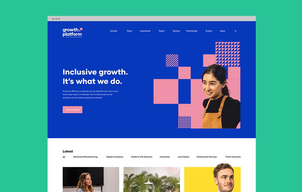
Developing an identity, name and creative strategy for a new business hub that would deliver business support across the entire region, the Growth Platform.
The identity had to reflect the regions values while also projecting a welcoming personality.


From the name up, this identity had to convey optimism, personality and professionalism for a brand that would eventually be exported across the globe.
The brand concept revolves around energy and personality.
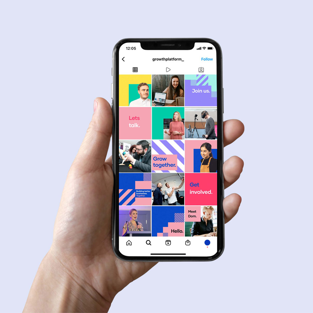
We chose a dynamic typeface and a contrasting palette of heritage and vibrant colors to symbolise both the traditional and the modern.
To enhance the graphics, we placed people at the core of the brand identity. By interacting with the typography and brand elements, we emphasise the importance of engagement and experience – qualities that are intrinsic to Liverpool.
A digital first approach meant that we could bring the identity to life across all digital media.


