
Creating an Olympic game changer.
An introduction to Lance Wyman – designer of the ’68 Olympic Games and his legacy for design.


Alex Frech
In the world of graphic design, few logos have achieved the iconic status of the 1968 Olympics logo. The mastermind behind this emblem was Lance Wyman, a visionary designer whose work for the Mexico City Olympics left an indelible mark on the history of design. This article delves into the story of Lance Wyman, his design philosophy, and the creation of the 1968 Olympics logo, a symbol that revolutionised visual communication in sports and beyond.
Some background.
Over a series of design focussed events, Designival became a staple in the diary for the creative and design community here in Liverpool and across the North. As a co-founder of this event, B&G were delighted when in 2012 (that does seem a long time ago) legend in design; Lance Wyman, agreed to pop over the pond and pay us a visit as a guest speaker. Hear first hand about his process, plus a few pictures from that wonderful event at Camp and Furnace in Liverpool, way back when.
Lance Wyman: A Visionary Designer
Born in Newark, New Jersey, in 1937, Lance Wyman showed an early interest in art and design. He studied at the Pratt Institute in Brooklyn, where he was exposed to the emerging trends in modernist design. Wyman’s approach to graphic design was heavily influenced by the principles of clarity, simplicity, and functionality, which were hallmarks of the modernist movement.
Before his work for the Olympics, Wyman had already established himself as a talented designer. However, it was his collaboration with the 1968 Mexico City Olympics that catapulted him into international fame. This project was not just about creating a logo but developing an entire visual identity system that would communicate the spirit and culture of Mexico to the world.
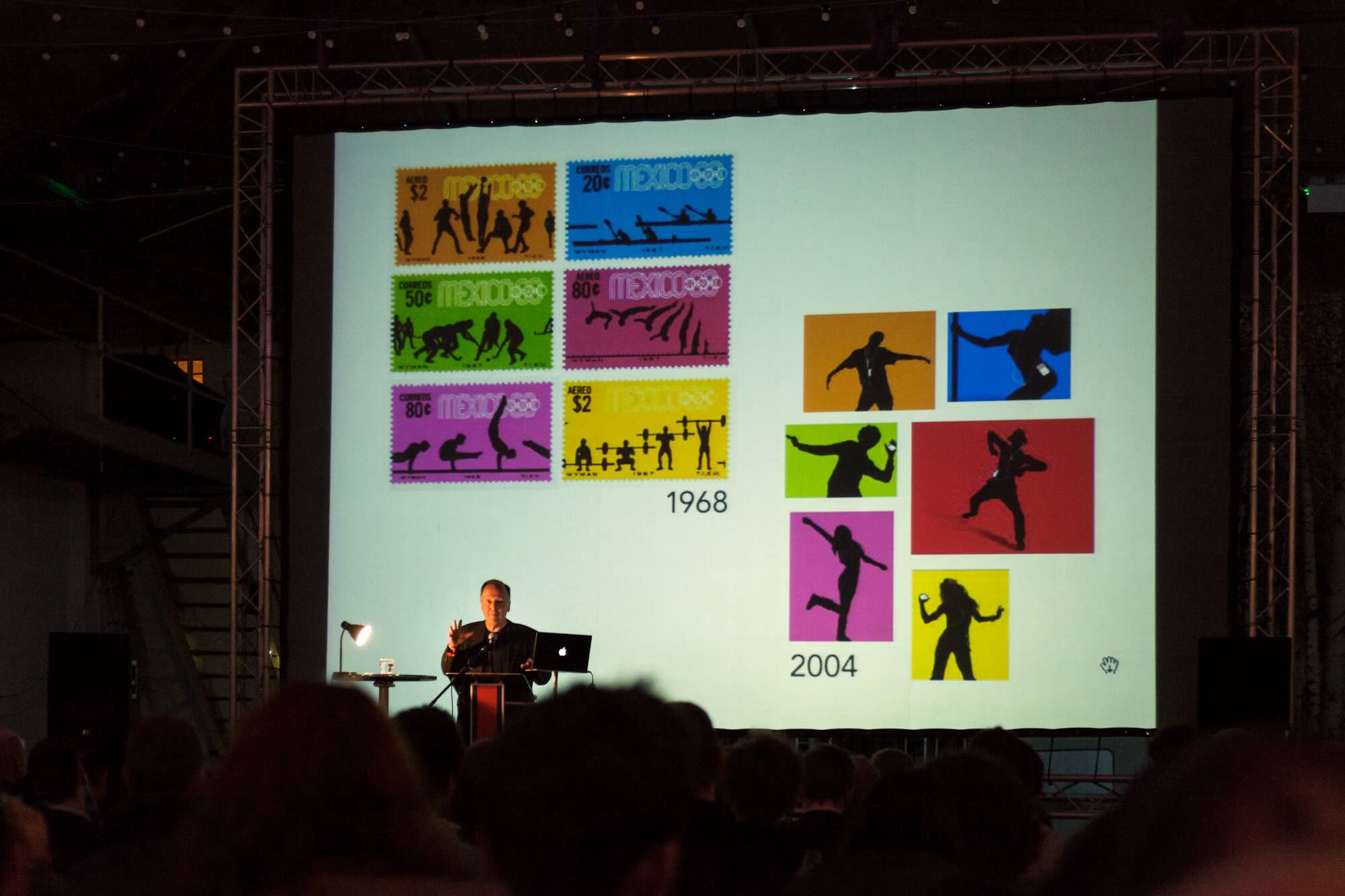
Lance shows us how the pictograms they created in 1968 continued to have creative impact today.
The Challenge of the 1968 Olympics
The 1968 Olympics presented unique challenges and opportunities. Held in Mexico City, the event was the first Olympics to take place in Latin America. The organisers wanted the design to reflect Mexico’s rich cultural heritage while also embodying the modern, forward-looking spirit of the Olympics.
Wyman, along with a team of Mexican designers, set out to create a visual identity that would be both distinctive and cohesive. The primary challenge was to develop a design that could seamlessly integrate the diverse elements of Mexican culture with the universal language of the Olympics.
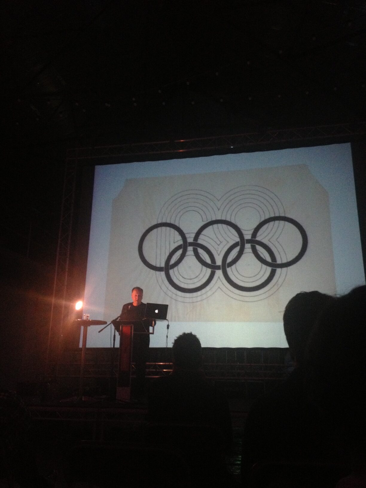
Lance explains how a lot of inspiration at that time came from Op Art and the works of British designer Bridget Riley.
The Birth of the Logo
Wyman’s design process for the 1968 Olympics logo was meticulous and innovative. He drew inspiration from traditional Mexican art, particularly the geometric patterns found in indigenous textiles and architecture. These patterns were characterised by their bold lines and vibrant colours, which Wyman skilfully incorporated into his designs.
The final logo featured the word “Mexico 68” rendered in a striking typographic style. The numbers “6” and “8” were intertwined with the Olympic rings, creating a sense of unity and continuity. The design was both modern and deeply rooted in Mexican cultural motifs, a perfect blend of the past and the present.
One of the most remarkable aspects of the logo was its versatility. Wyman developed a comprehensive visual identity system that extended beyond the logo to include posters, signage, uniforms, and even the design of the sports venues. This cohesive approach ensured that the visual identity of the 1968 Olympics was instantly recognisable and memorable.
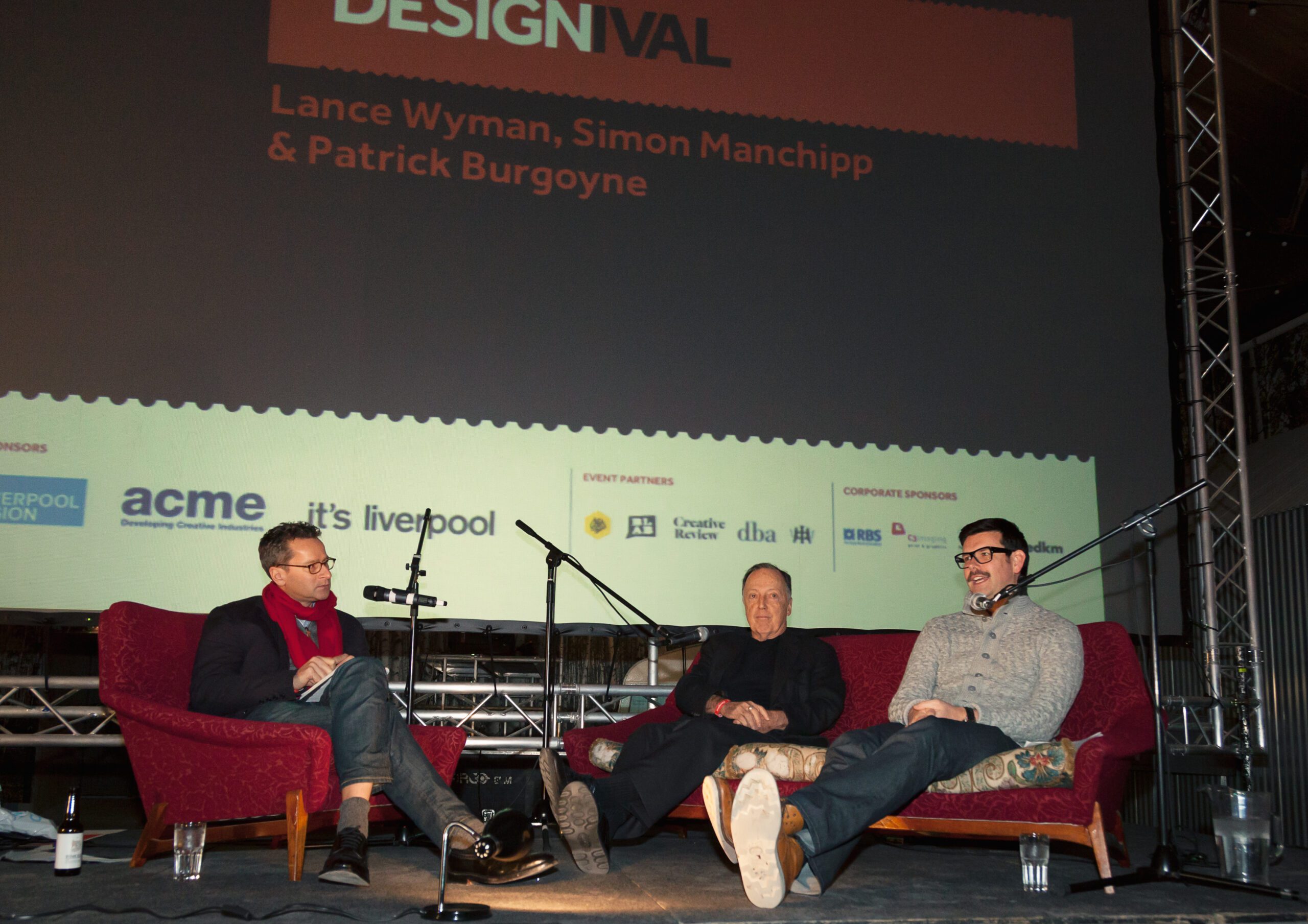
Q&A with Simon Manchipp (SomeOne) and Lance Wyman.
Legacy and Impact
The success of the 1968 Olympics logo cemented Lance Wyman’s reputation as one of the leading graphic designers of his time. The logo was widely praised for its aesthetic appeal and its ability to communicate complex cultural themes through simple, yet powerful, design elements.
Wyman’s work on the 1968 Olympics had a lasting impact on the field of graphic design. It demonstrated the importance of cultural sensitivity and contextual relevance in design, setting a new standard for how visual identities could be crafted for global events. The logo also influenced subsequent Olympic designs, many of which adopted Wyman’s approach of integrating cultural elements with modern design principles. Take a look at the Paris Olympic 2024 logo and how this has a rich heritage in art deco, love and French flair.
The 1968 Olympics logo remains a landmark in the history of graphic design, a symbol of how thoughtful, culturally-informed design can make a lasting impact on the world stage.
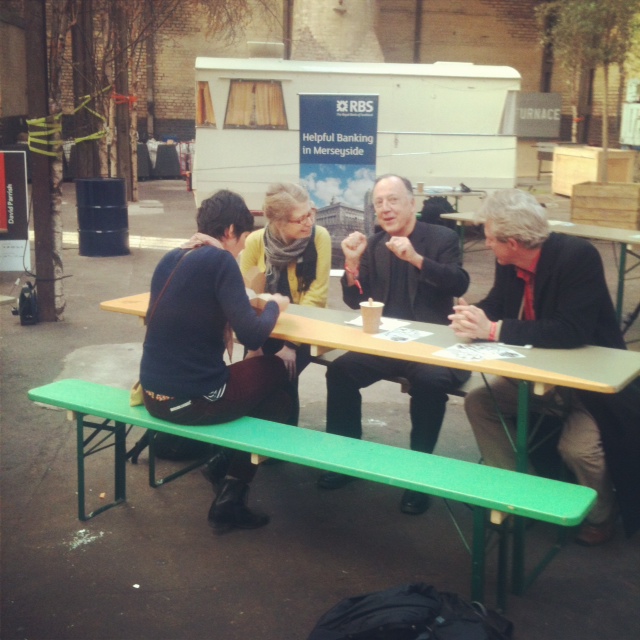
Lance at Liverpool venue Camp and Furnace after the Designal event having a chat with guests.
Drop us an email for more information.