
LA 2028 Olympics logo.
Dynamic or Disappointing?


P.O.V
The LA 2028 Olympic logo has sparked mixed reactions since its unveiling, with some praising its boldness and others questioning its execution. As the U.S. prepares to host the Olympics for the first time in over three decades, the branding for this global event carries significant weight. In this review, we dive into the design, exploring whether the logo truly captures the dynamic spirit of Los Angeles or falls short of expectations.
As the curtain closes on the Paris 2024 Olympics, which began with some hiccups but ultimately concluded with French flair, the spotlight now shifts to the United States, the next host of the Olympic Games in 2028. This will mark the first time since Atlanta in 1996 that the U.S. has hosted the event. The 2028 Games present a golden opportunity for the U.S. to not only elevate the Olympic spirit but also to unite the nation in a truly global celebration. But as a self-proclaimed leader on the world stage, how does the U.S. present itself visually for this monumental occasion? Fortunately, we don’t have to wait until 2028 to see the branding, as the LA 2028 logo has already been unveiled.
So, what’s the verdict? Is it dynamic? Yes. Simple? Certainly. Bold? Absolutely. But is the job done? Not quite.
This is a critical analysis, and something as globally significant as the Olympics deserves an honest review. Frankly, it feels like the design effort falls short.
Dynamic Design.
Dynamic identities are not a new concept. They’ve been around for some time, initially brought into the mainstream by brands like AOL and later by the City of Melbourne’s branding efforts. Even we dipped our toes into the world of dynamic branding in the late 2000s with our work for interior specialists, A White Room. So, to present this approach as something groundbreaking feels a bit disingenuous.
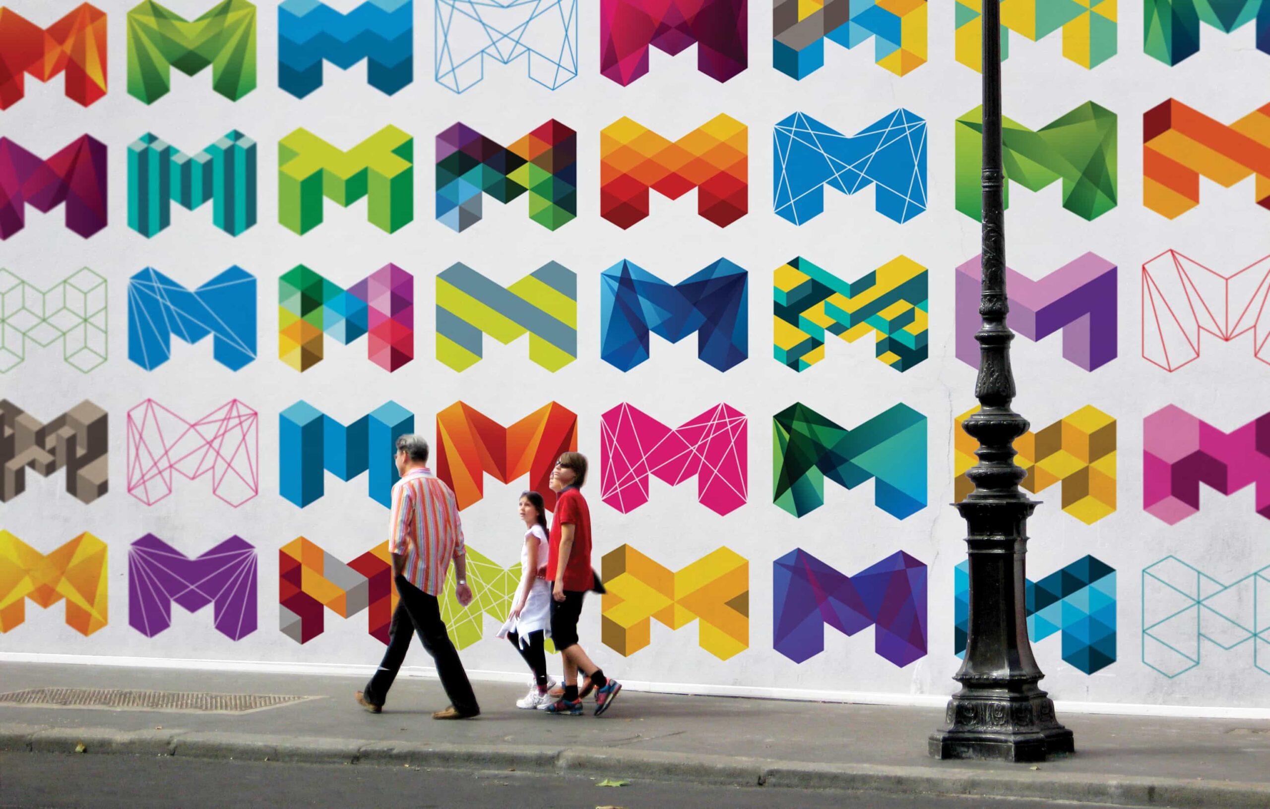
The key to a successful dynamic identity lies in its simplicity and its ability to seamlessly integrate various elements. However, what we see with the LA 2028 logo is far from seamless—it’s chunky, clunky, and feels somewhat lazy. The “LA” letters differ from the “28,” but not in a way that feels intentional or cohesive. The spacing feels off, and the interchangeable icons appear to be a last-minute addition, with a narrative that seems reverse-engineered to justify their inclusion.
Aol. flexible identity.
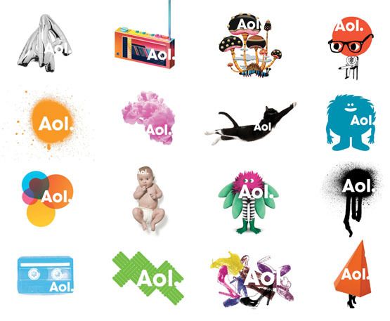
Aol. flexible identity.
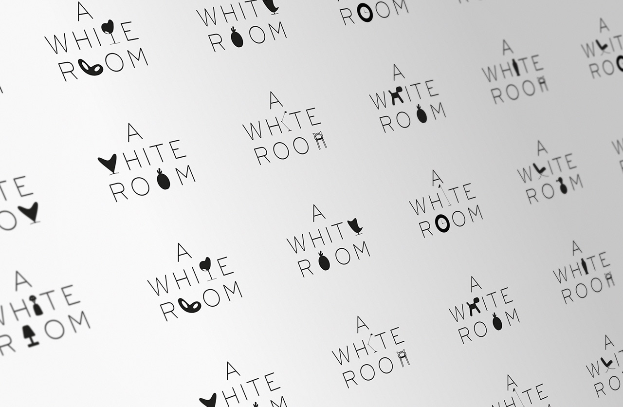
Flexible identity for interior client A White Room from around 2009 features designer classic silhouette characters to create bespoke logos.
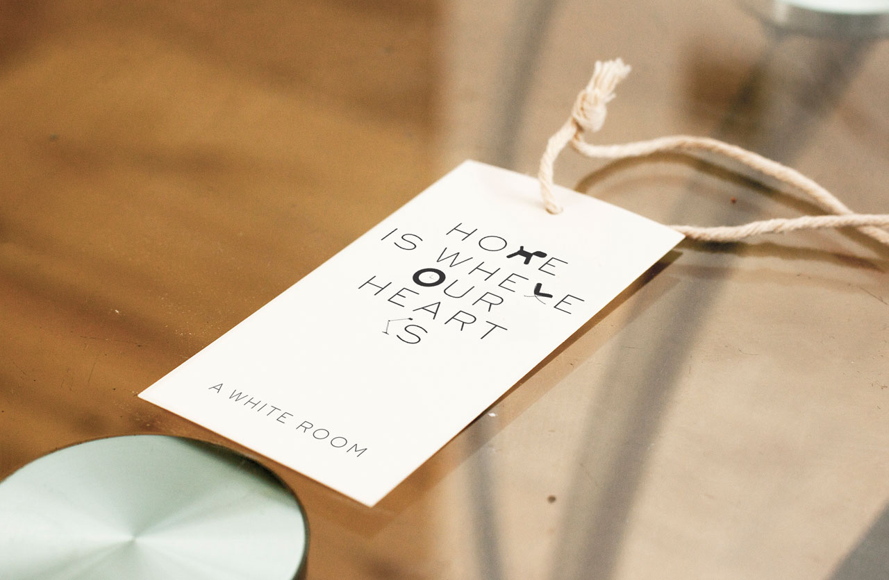
Price ticket design.
Complication or Compromise?
We’ve all been there—facing a tight deadline, you come up with a brilliant idea that still needs a narrative to tie it all together. So, you reverse-engineer a story just to get the project over the line. This is exactly what the LA 2028 logo feels like. It’s as if the initial concept was altered, perhaps by a head of marketing or even the Mayor, resulting in tweaked spacing, adjusted graphics, and mismatched fonts.
While the idea of inviting people to contribute and create their own versions of the letters is appealing, it lacks depth and cohesion in its current form. Imagine a more thoughtful approach, perhaps a Rolodex of letters inspired by different aspects of American culture—interchangeable elements that truly represent the diversity and dynamism of the nation. A nationwide and global call-out for creative contributions could have been an exciting way to engage the public and generate buzz on social media.
Moving Forward: A Call for Refinement
Let’s be clear: designing the identity for an event as significant as the Olympics is no small feat, and we acknowledge that this is only the first iteration. However, with the immense pool of design talent in the U.S., we hope that the LA 2028 logo will evolve into something tighter, more reflective, and more genuinely connected to the narrative it aims to convey.
The dynamic face of modern America deserves a logo that is equally dynamic, yet cohesive—something that resonates with people both locally and globally. The LA 2028 Olympics should be a celebration of creativity, diversity, and unity, and its branding should reflect just that. Let’s hope future iterations rise to the occasion.
Drop us an email for more information.