GoodMarket’s XL event drives 4000 visitors
Targeted campaign drives over 4000 visitors to GoodMarket’s Double XL event.
Building on the momentum from the successful GoodMarket XL event in October 2023, B&G collaborated with GoodMarket to plan their next major event.
Challenges and Strategies
The team faced several challenges, notably introducing a ticket fee for the first time and engaging the public for a post-Easter event. To tackle these, the focus was on creating a spring-themed campaign. This involved extensive R&D to maintain the theme of “inflated delight,” resulting in a new, bespoke graphic design for the two-day event.
Creative Approach
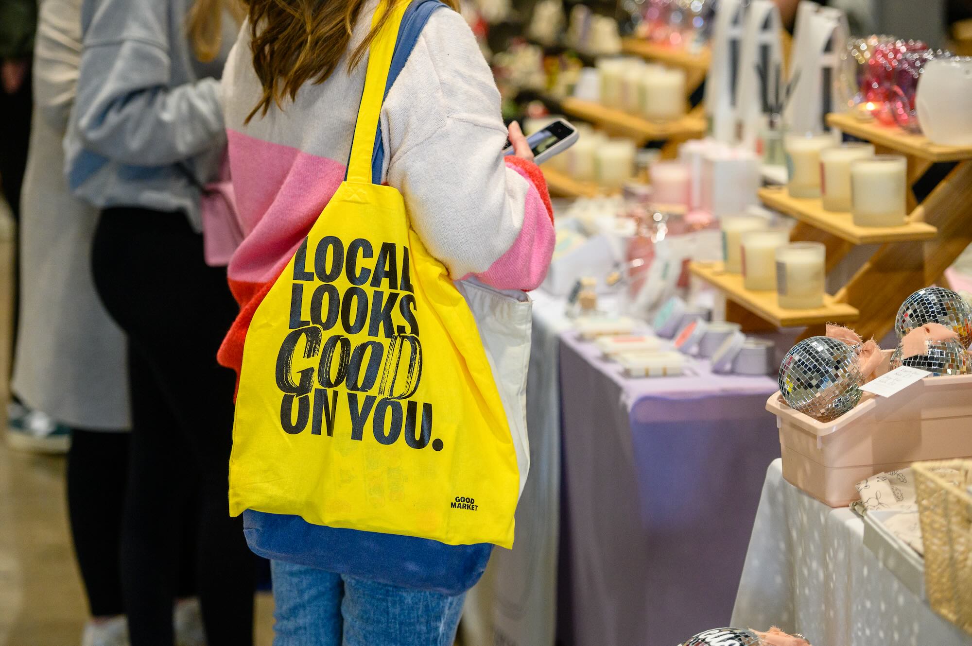
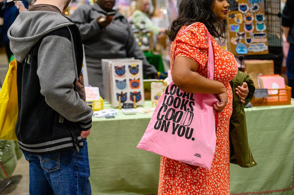
A bright pink bubble gum design was chosen for its fun, lighthearted, yet confident and bold appeal. This new visual identity resonated with the ethos of GoodMarket and was quickly embraced by all 240 traders.
Marketing and Engagement
The predominantly digital-led campaign achieved significant reach on social media. Additionally, the support from event retailers, who were provided with brand and marketing packs, amplified the campaign’s effectiveness.
Event Success
Despite initial reservations, the event was a resounding success, attracting over 4500 visitors to the Exhibition Center Liverpool. The 30,000 sqft space was buzzing with energy and the vibrant spirit of a creative community.