
First impressions can say a lot, and the first time we met with Mike and his family we weren’t disappointed. Their passion for their craft enlightened, while their confidence in their quality was reassuring to say the least.
Sales have never been better.
Mike tells us.


Complementary elements of the brand include a suite of bevels which have been converted into fine stroke lines which represent the delicate nature of the craftmanship thats involved with every worktop be it marble or quartz. These bevel details can be overplayed over images and flat colours.

The serif typeface for the headlines is Libre Baskerville. Selected for its craftsman style qualities and human approachability. While headlines are sans serif to represent the clean and modern approach of the business.
Colour palettes are simple and contemporary, with a heritage nod. Also the blue is a modernisation of the previous logo type.

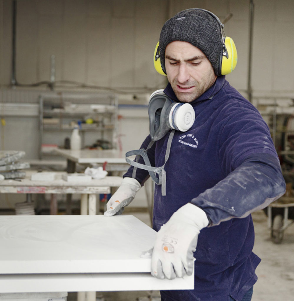
Portrait and interior shots were taken by Award winning photographer Dan Kenyon.
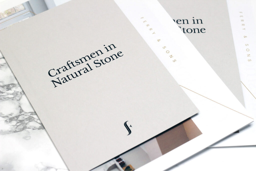
Stationery printed on GF Smith Cobalt. Brochure wrap printed on GF Smith Leather ‘pale grey’.
You can view the full Ferry & Sons case study here
