


Creative ad agencies take the fight back to AI
Creative ad agencies take the fight back to AI
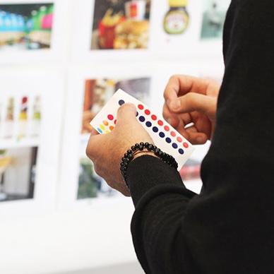
It has been well documented that AI is rapidly dismantling the creative sector one prompt at a time. However, all may not be lost as ad agencies begin to fight back by putting AI on the ropes in exchange for real brainpower.
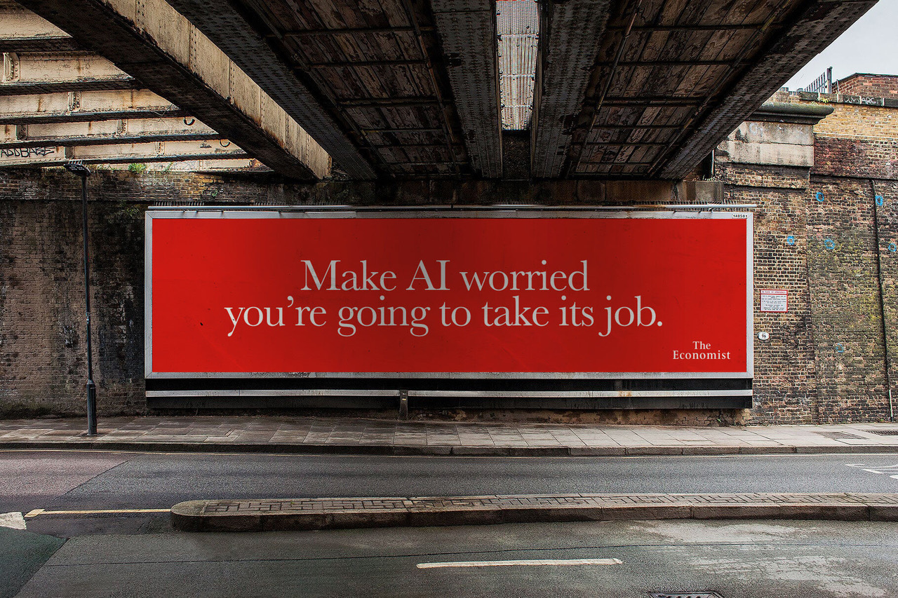
Let’s not devalue AI. It’s quick, clever and, if you’re only average at your job, you’re pretty screwed. But to the ad world this is just the start and the gloves it seems are well and truly off.
Most AI is based on what already exists. It reworks and reorders data from the last 30 years to create new solutions. But what about the new new, the ideas that haven’t yet been created, haven’t even been considered. Maybe, just maybe, this is where true brainpower excels.
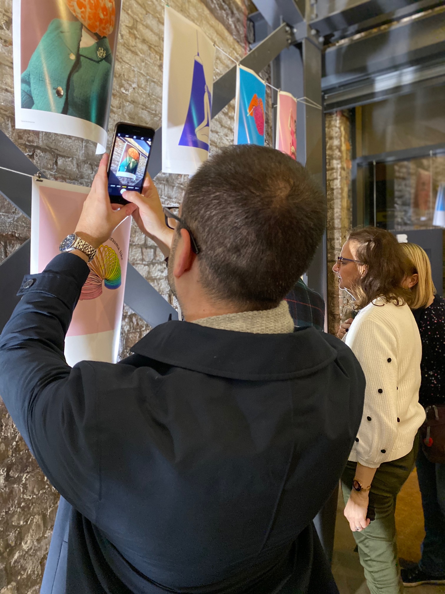
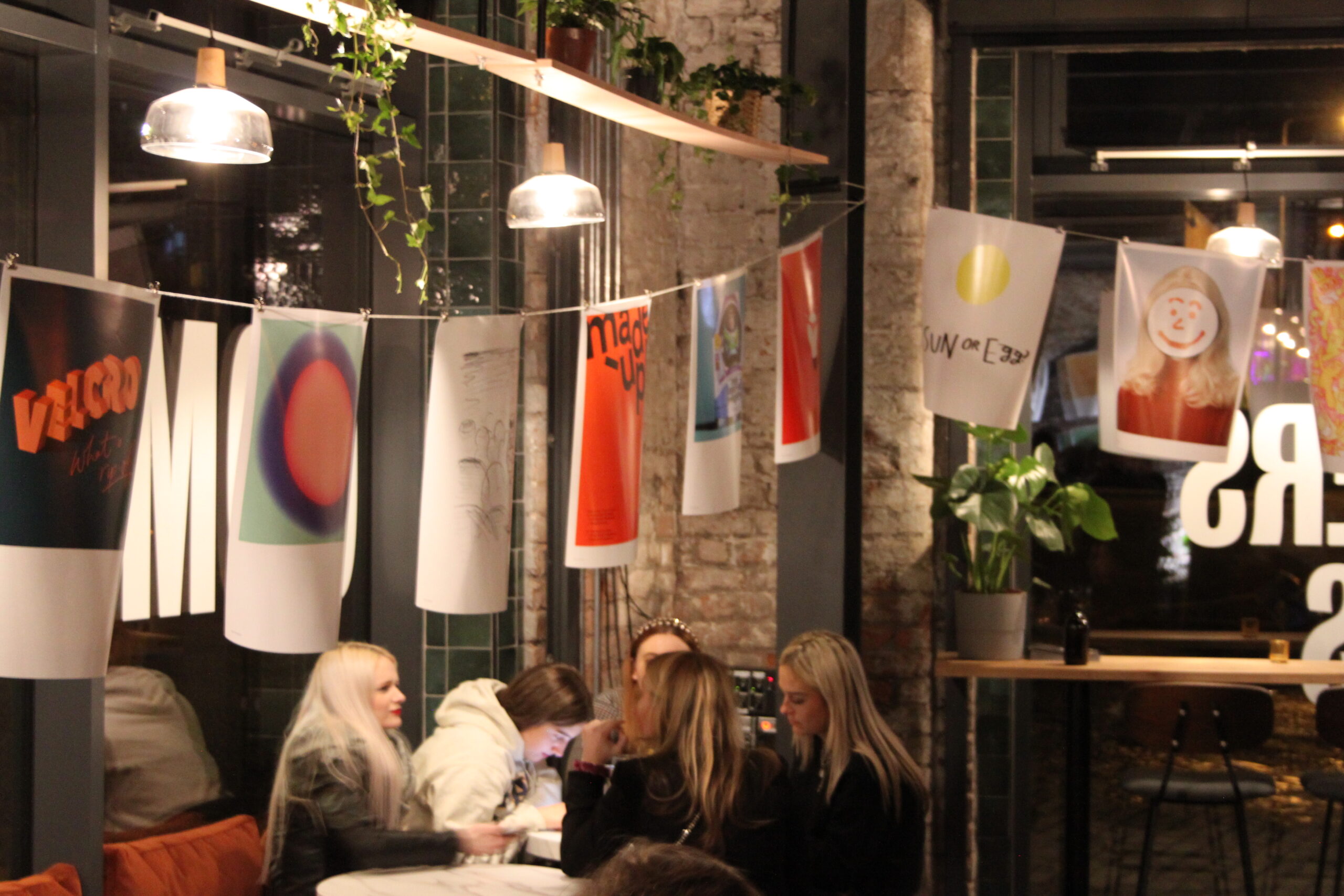
Over the last few months I’ve been tracking the industry’s response and I’ve been pleasantly surprised.
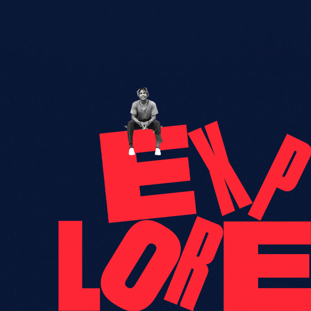
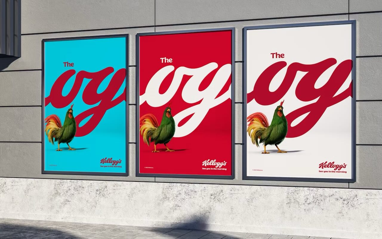
When @Leo Burnett relaunched the @Kellogg’s OG campaign earlier this year I was excited to see a bold shift towards strategic, confident creativity and brand ownership. This wasn’t the same Canva template everyone seemed to be using. It felt both traditional and modern. Kellogg’s were back, dominating the cereal space and the breakfast bowl.
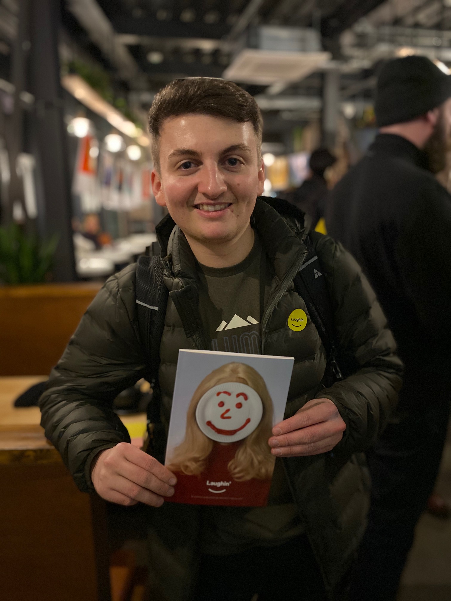
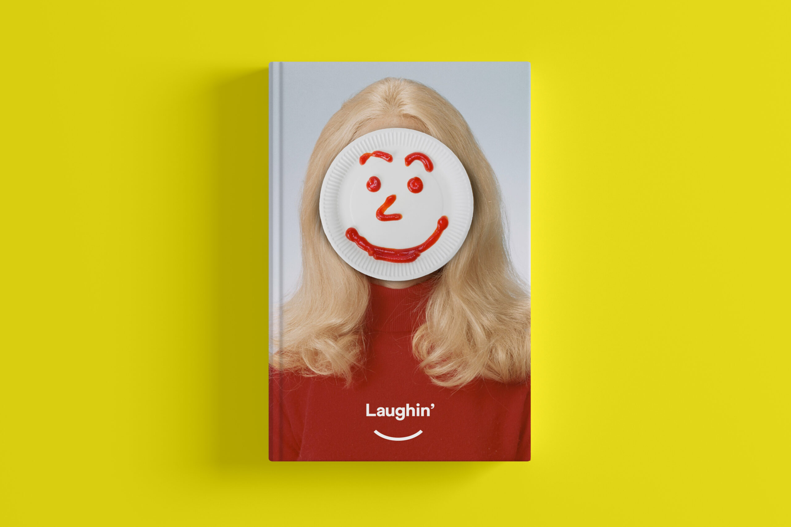
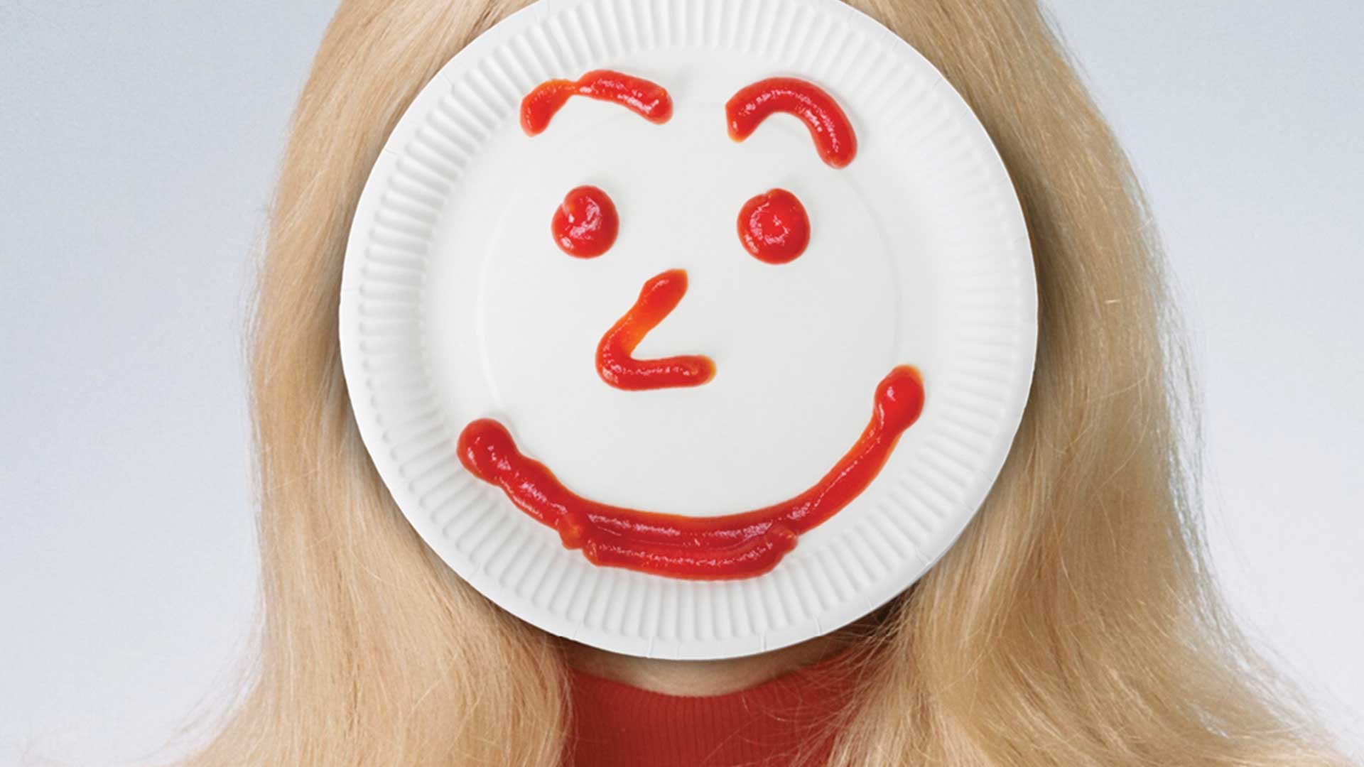
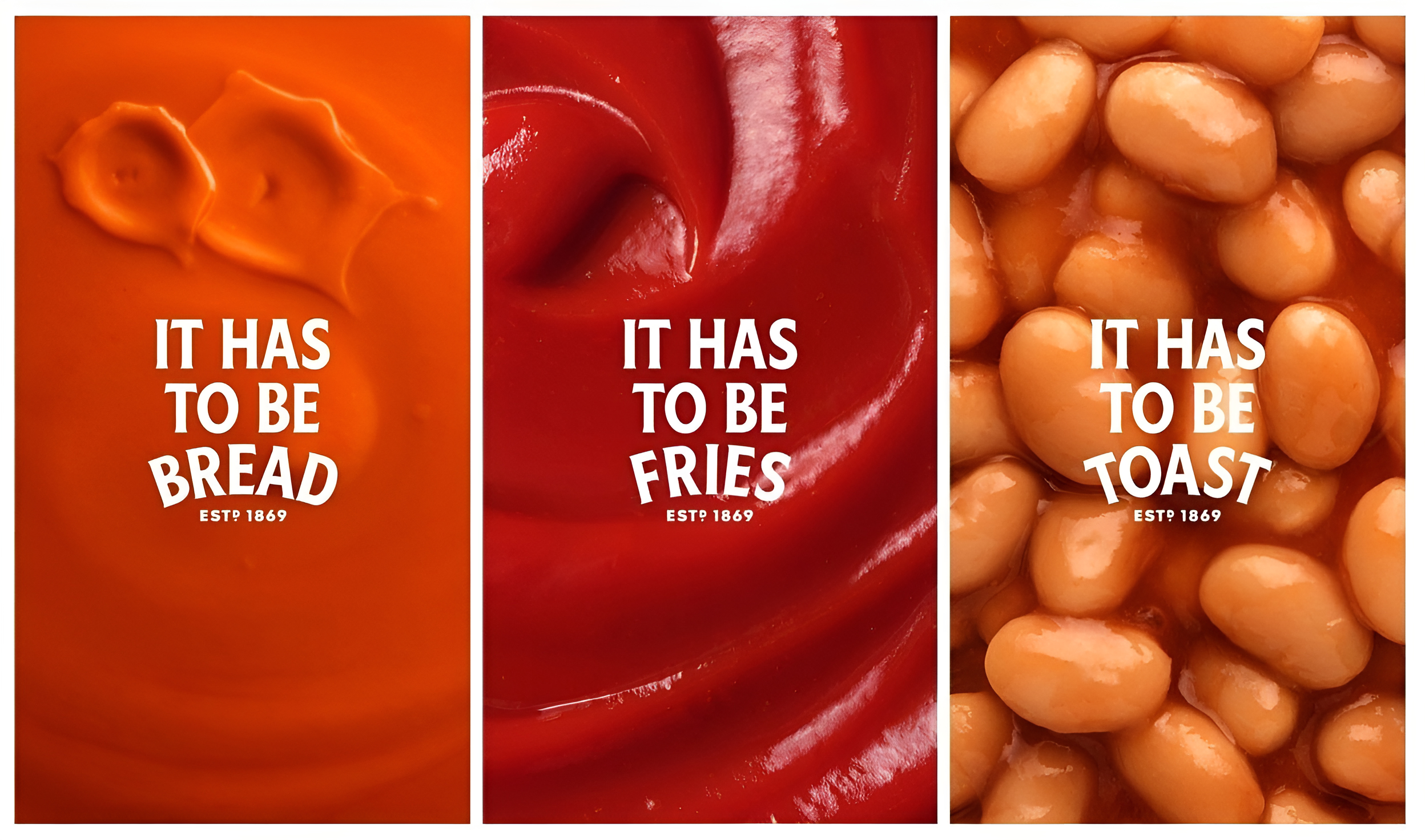
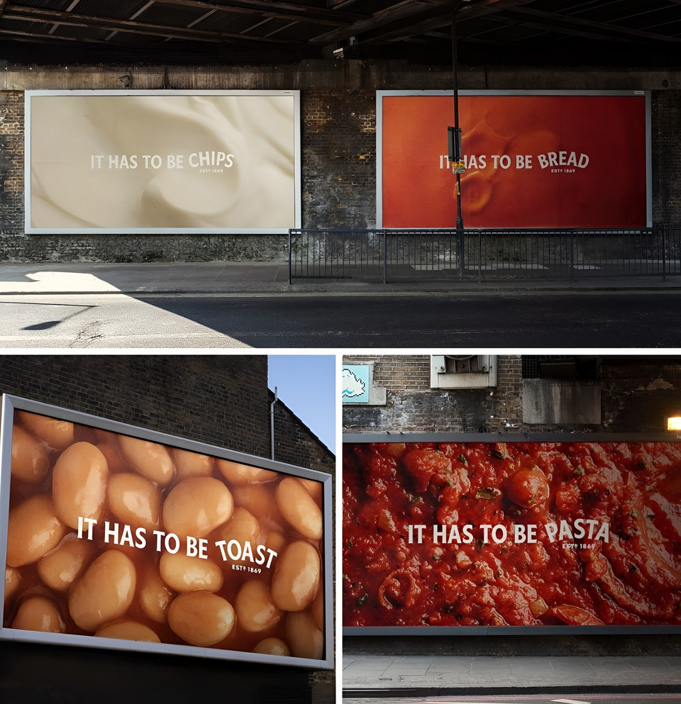
Earlier this year I was blown away by @Heinz and their superb Just Add Bread creative by @Wieden + Kennedy London as part of the Trigger the Taste campaign. It was bold, clever and didn’t even require a logo. One of the first ads in a long time that truly respected the audience’s intelligence and actually made them think. Imagine people using their brains. Just brilliant.
There’s that saying we don’t know what we don’t know. I think that’s our job now as creatives, to push forward and create the new, new.
Agencies are fighting for their lives and delivering better than ever. This fight ain’t over.
If you want to talk to me about creative ideation then just drop me a DM.
#Advertising #Strategy #Creativity #AI